
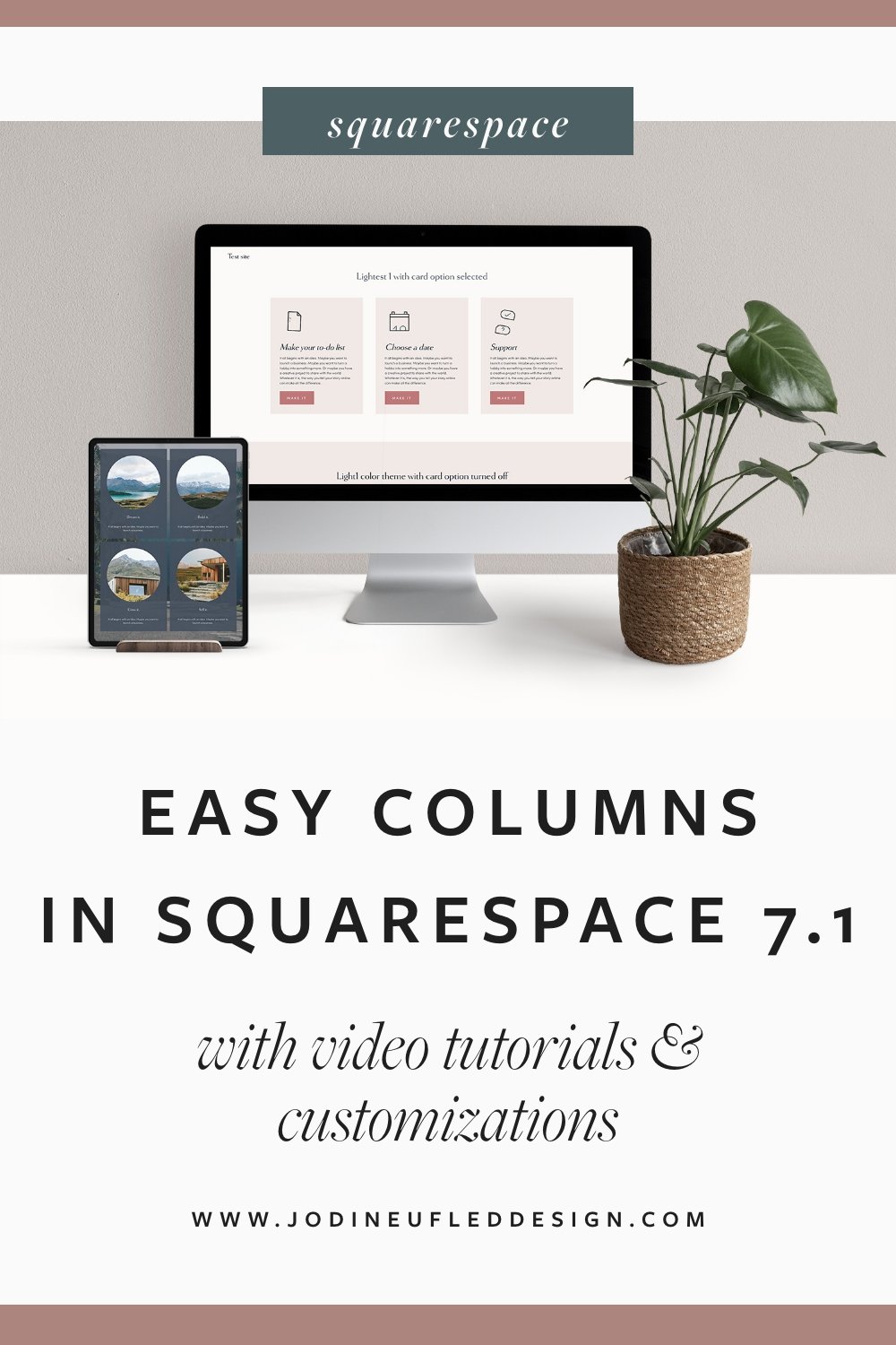
Easy column layouts in Squarespace 7.1
Creating beautiful column layouts in Squarespace is now easier than ever with the arrival of the list section layouts!

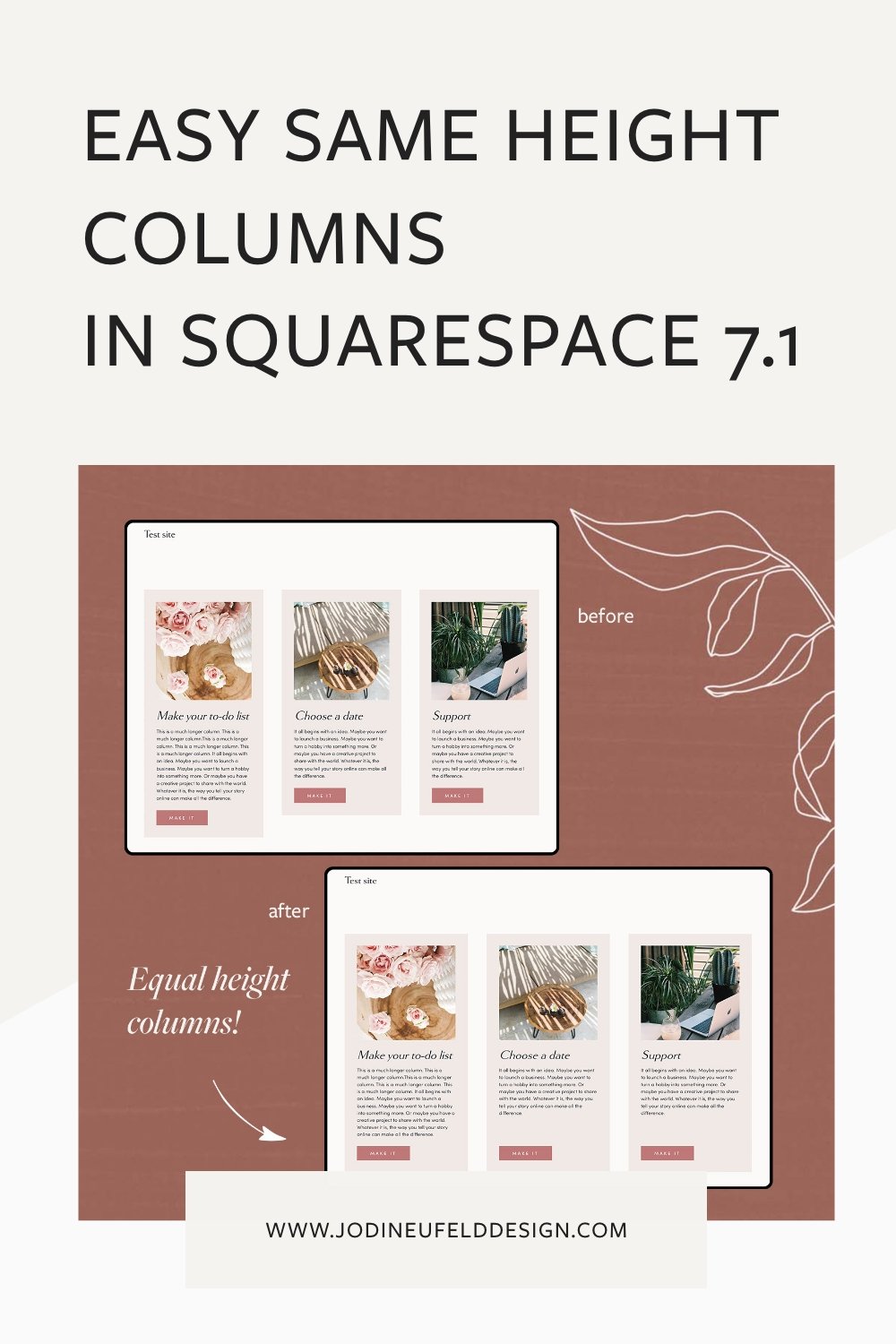
Previously to get these same layouts we had to use code and they were not easy for the end user to edit. And now the other amazing thing is we can get all our columns to be the same height without having to use any code!
Not only that, but the items appear correctly in mobile without us having to worry about how we add the content in.
The list section in Squarespace has 3 options for Designs as of this time:
Simple List
Banner Slideshow
Carousel
This post will focus on the Simple List layout.
In Squarespace 7.0 and up till recently we were restricted to creating columns manually. I wrote a post about how to create column layouts the correct way on Squarespace 7.0 which you can read here. This will still be the way to create columns if:
you are on Squarespace 7.0
you need content in your column that is beyond the limitations noted below
With the list sections there are only 4 possible content items that they can contain:
a single image
a title
a description
a button
If you need to add a form block for instance, then the list section will not be an option for you.
However, if your criteria is met by all of the above, the list section is a great new feature in Squarespace 7.1 which is easy to edit and allows us to create beautiful column layouts.
How to create a column layout in Squarespace
To access the option that allows you to add a list (or column) section, select “Edit” on the page that you want to add the layout to. Navigate to where you want the section to be and then click on “Add Section”.
Note: With the release of Fluid Engine, this menu has changed. To find the list sections now click on “People” and choose any of the options with the “i” in the circle:

Squarespace has some layouts for us to start with already (but they all can be adjusted!). Choose a layout that best matches what you want your section to look like.
Once you have clicked on a layout, you will have the option to “Edit Content” to adjust all the settings.
Note: If you have chosen a different Design other than “Simple List”, just click on the drop down menu on the Design Tab to choose the “Simple List” option

Here is a video walkthrough on how to style your column section:
Make the height of the List items all the same height

This is a super simple way to make sure your columns are even, no matter how much content they have in them!
Here is how you do it:
Select “Edit Content”
Go to the “Design” tab and then select “Size & Space” (last option on this menu)
Scroll to the very bottom and choose the last option for “Position”

This video goes over the instructions on how to have equal height columns in Squarespace 7.1:
To adjust the height of the List section follow this tutorial
You can also control how much space appears above and below your list section column layout:

Choose the Design tab and then scroll down to “Size & Space”. Look for “Vertical Padding”. You can select small, medium or large or click on the 3 dots to control the top and bottom padding separately by adjusting the sliders under “Padding - Top” and “Padding - Bottom”
Watch the video to see how to adjust the section height:
Styling the colors and fonts of the list section
All of our color options for our list section will be dependent on our Site Styles settings for the color theme we are using. We will need to open the Site Styles panel to find that color theme and adjust the settings for the Simple List settings.
Watch the video to see how to style your list section
Creating a card layout with circular images
Here is an example of a fun layout you can do easily with the new List section. Circular images are so easy now with this option! Choosing a card layout and a background image and you have this option in no time!
List Section Customizations
The List Section “out of the box” is very customizable, but there are still some things we cannot control without using code. If you are desiring any of the following changes then you will need to use code - don’t worry - I walk you through how to add it. These are all optional adjustments.
I do mention in the videos how apply the code to certain sections on your website only using the Squarespace ID Finder tool by Heather Tovey. You can add the extension to your Chrome browser here.
To insert the code from this tutorial on your Squarespace website that I have below you will need to select the “Design” option from your Squarespace menu and then select “Custom CSS” and paste the code in there. Watch the videos for clarification.
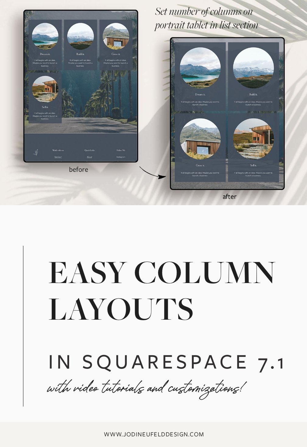
Change the number of columns that show on tablet

Tablet devices are always the most tricky for content layout. What looks good on a desktop often looks poor on a tablet device - especially in portrait mode.
When we have 4 columns on desktop then it often shows as 3 columns across on a tablet device. That’s not too bad, except for when we have exactly 4 items and 3 appear on 1 row and 1 appears on the next row. That does not look good!
Here is how we can control our column layout on portrait tablet devices:
Here is the code to copy and paste to change the columns on portrait tablet devices:
section-selector-here {
   @media only screen and (min-width:768px) and (max-width: 1024px) {
    .user-items-list-simple {
     grid-template-columns: repeat(2,1fr) !important; // change first number to be the number of columns on tablet
     }
   }
}
To change the number of columns on tablet, adjust the first number in the parentheses to the column numbers you would like:
To customize the code for the number of columns on tablet
Reduce the width of the List Section
Sometimes we want to have more control over the width of the list section. As of this writing we only can select “Full” or “Inset” and not a custom amount.
Here is how you adjust the width:
Here is the code to copy and paste:
section-selector-here {
   .user-items-list{
      padding-left: 10vw ;
      padding-right: 10vw;
   }
}
You can adjust the padding amounts to your desired amount of spacing (ie 10vw)
I hope you got some good ideas on how to easily create column sections in Squarespace 7.1 using the new List section! This section allows for a lot of customizations without the use of code. Another reason to love the new Squarespace 7.1 platform!
Are you still on Squarespace 7.0, but want to make the switch to 7.1? There is no built in way to bring your content over from one platform to the other at this point, but I do have a service in which I provide that. Check out my Squarespace Design Day for more information on how we can get you onto 7.1 and refresh your site design at the same time!
Pin it for later