
Creating column layouts in Squarespace correctly
Note: This tutorial applies to Squarespace’s Classic Editor. Their new editor, Fluid Engine, introduced in summer of 2022 allows for a drag and drop approach and therefore this tutorial would not apply. If you are still on the 7.0 platform then you will still be using the Classic Editor.
Note: If you have a website on the newest Squarespace platform (7.1) then you have access to a very easy way to set up column layouts on Squarespace.
This frustration does not exist in 7.1 - no spacer blocks anymore(on regular pages - they still exist on blog pages though)!! This is just one of many benefits of switching over to the new Squarespace 7.1 platform.
Looking to move over??? Your columns will migrate properly using the proper migration tool used by professionals like me. Hire me for the day to get you set up on Squarespace 7.1
Read all about how to get easy column layouts in Squarespace 7.1 including equal height columns here.
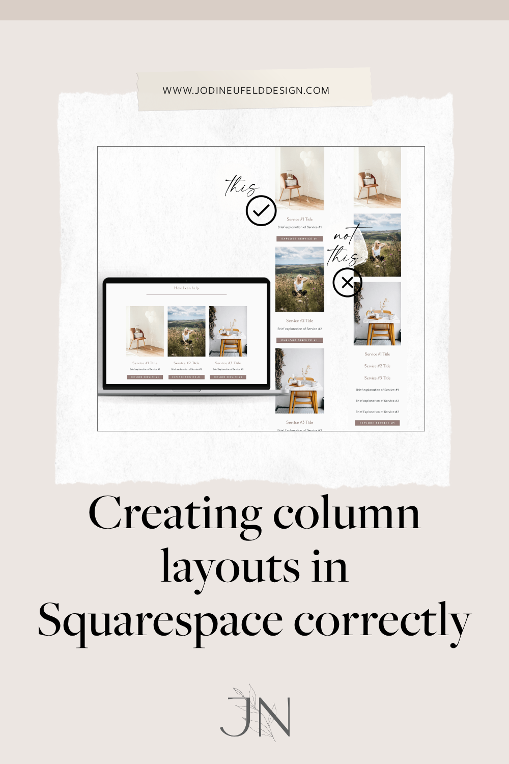
One of the things I see people struggle with again and again on Squarespace are ways to set up their layout in columns so it works well on desktop devices as well as mobile. There are numerous strategies for laying out columns in Squarespace which we will review in this post.
An example of how the incorrect setup of columns appears on mobile:
Not sure what I am referring to? Here is a sample of what I mean. You set up your content on your desktop computer and it looks like this:
and then when you view it on mobile, it looks like this:

Not good…. Ok, let’s look at how we fix this:
Laying out columns on Squarespace using the spacer block
First things first - in order to layout your columns in the correct format, you will definitely want to use spacer blocks to create your columns.
First, insert the same number of spacer blocks for the number of columns you want across.
One thing to note is that Squarespace uses a 12 column grid system. so to have equal columns using spacers, it will only work if you have a # of columns that is divisible by 12. So for instance, the following options are available for equal sized side by side columns in Squarespace: 2 columns, 3 columns, 4 columns and 6 columns.

Once we have our structure in place, we can add whatever content we want directly under each spacer block. Add your images, text, buttons, etc. Once you are done, you can delete the spacer blocks as they were only used to set up our layout.
Squarespace places each block from left to right on desktop and stacks it top down on mobile so the key is to make sure that each "block" has all of the elements in it that you want such as the image, the text and the button. How do you go about doing this?
Laying out columns properly so they display correctly on mobile
Watch the video to see how to set up the columns properly:
Looking for ways to make your content look better in columns?
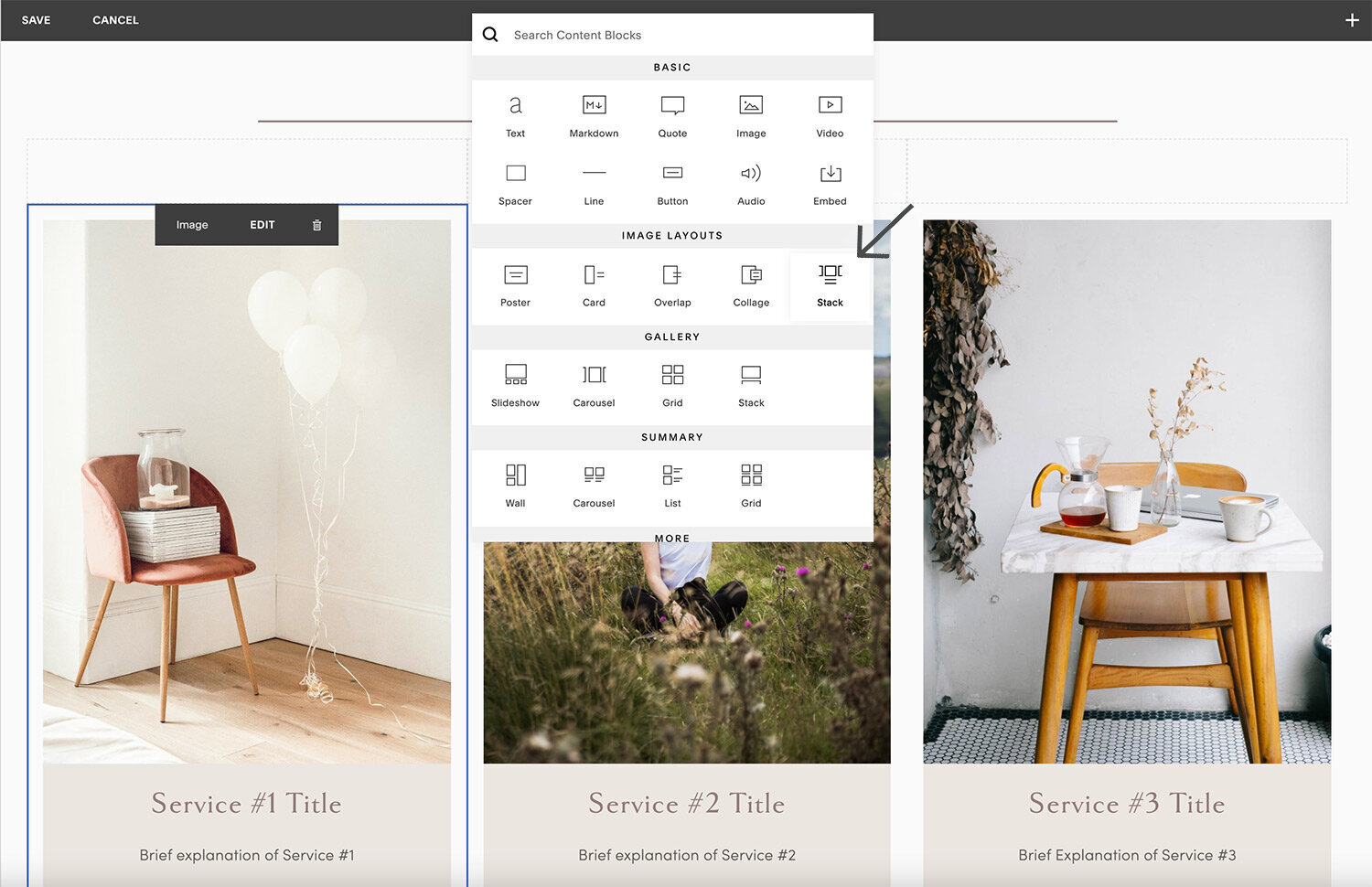
One easy way to ensure your content displays properly on both desktop and mobile is to use the stack image block layout in Squarespace. You will not need to worry about grouping your image/text and button properly if you use this block.
To insert a stack image block, click on the blue + sign to insert a block then select “Stack” from under the Image Layouts section:
Then:
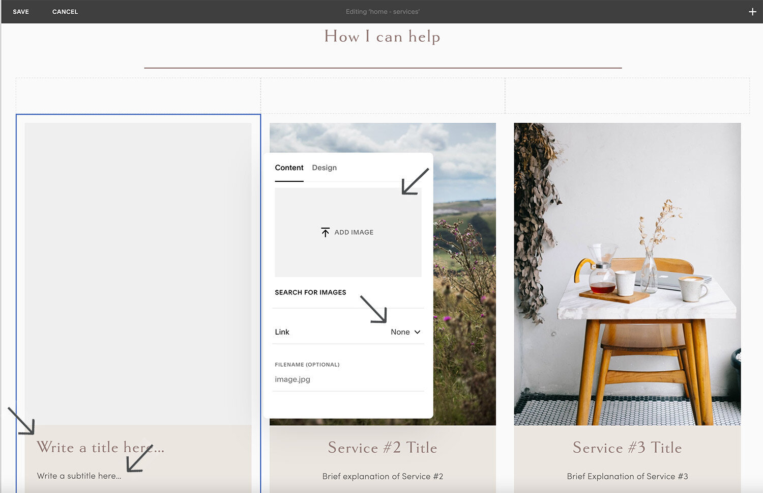
Upload an image for the block
If you want the block to link somewhere you can select “on image” for the image to link or if you want a button select the button option and then enter your button text. For both link options you will need to link to the appropriate spot.
Enter your title and subtitle
Go to the Design -> Site Styles panel to style your fonts and colors for this block.
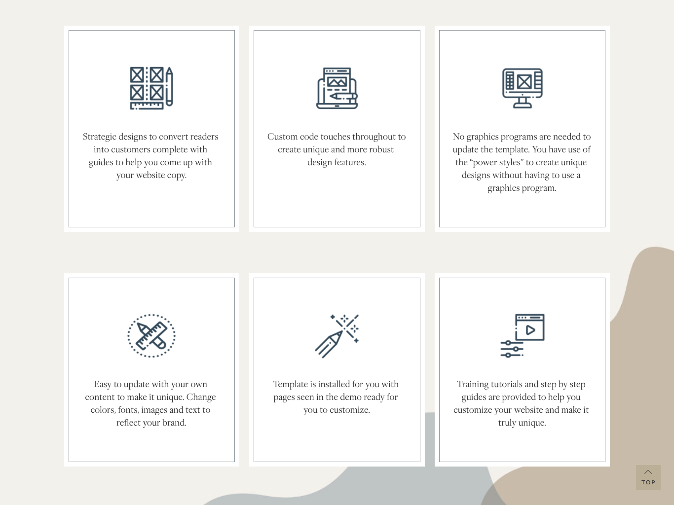
For an elevated column layout look use this Squarespace plugin:
One of my most used plugins is by Squarestylist. Her easy grids course/plugin allows for your boring column blocks to be styled with background colors, borders and even hover effects. There is also code to make sure the blocks are the same height and the buttons align at the bottom. This is the perfect option for service packages, icons with text and so much more. I find I use this plugin on most custom sites.
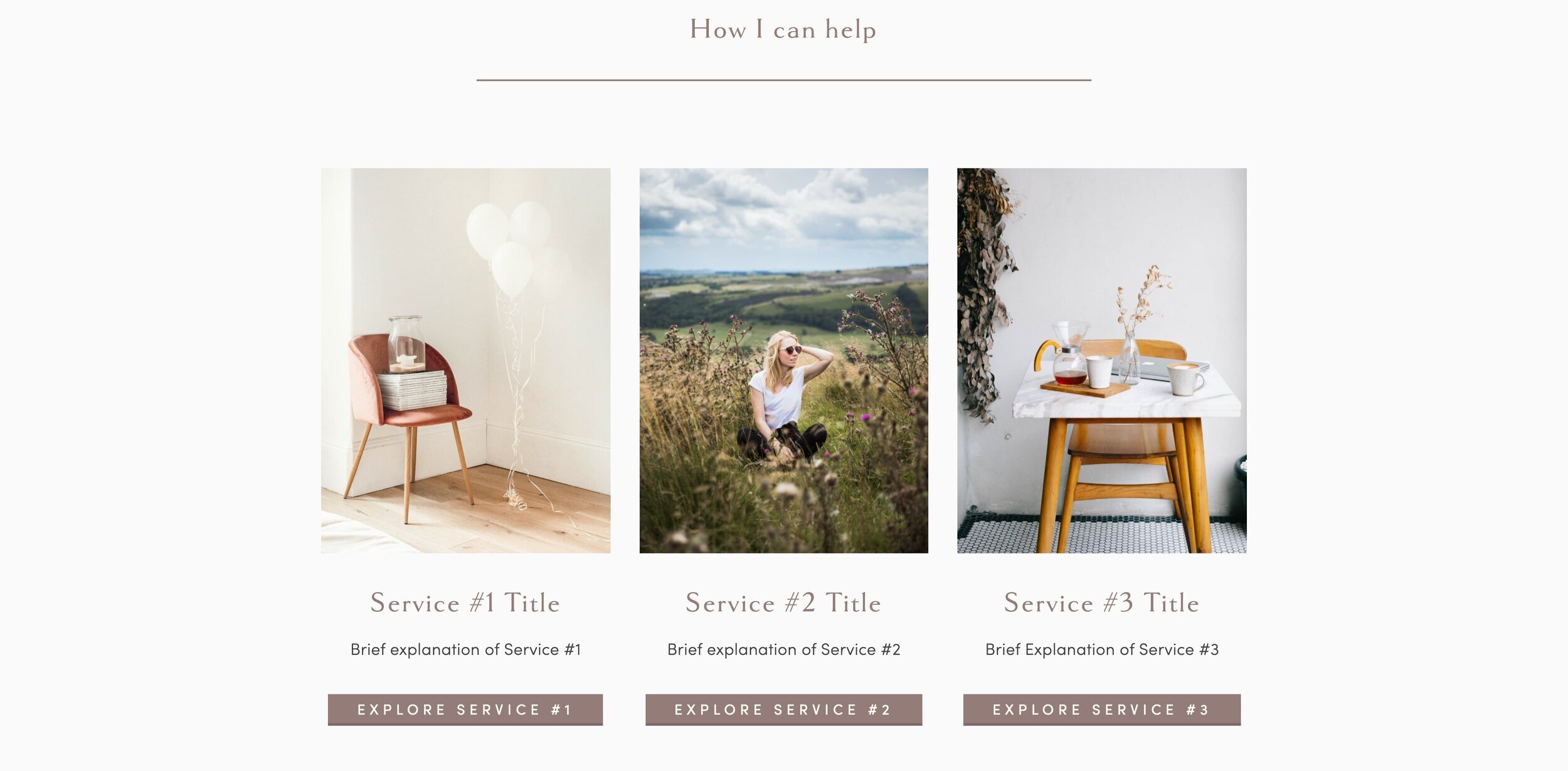
Here are a couple of examples of this plugin in use on my own site:

*note - this is an affiliate link which means I receive a small commission for any purchases you make at no additional cost to you. Always remember that I will never share or promote a tool or resource that I don't use and love myself!
Hopefully that helps you with creating column layouts that work on every device and ways to make your column layouts look better!
One of the many benefits of Squarespace 7.1 is that we do not have to deal with this anymore! There are no longer spacer blocks and we have better control over our mobile layout.
Here is how we set up columns in Squarespace 7.1.
Read about all the benefits of switching to Squarespace 7.1 here.
pin it for later