What should you include in your website home page content? (with examples to follow!)
One of the things I discuss with my web design clients on our consult call for a Squarespace Design Day is the issue of what content would be best for their website home page. I get it - this can be overwhelming! It’s hard to know exactly what content is needed and how much content. I have helped over 100 creative businesses create a high converting, streamlined Home page using these strategies.
Your website home page is one of the most important pages on your website for convincing your visitor that you are the best option to help them with their specific problem.
But, what is the best content for a website homepage? What do we include in our home page?
Let’s dive into these website homepage tips to see how we can maximize our home page to appeal to our site visitors and get them interested in working with us.
I find that most people get inspired by seeing examples so I have provided many examples of sites I have worked on that do a good job of demonstrating these website homepage tips.
What do you put on a website Home page anyway? Here are some secrets to home page content that attracts and converts:
table of contents
Answer the questions: what/who/how and where
Summarize what you do and how you solve the problem
Provide “doorways” or portals to other pages on your website that will go into further detail
Show your face and a brief introduction
Provide a way to start a long term relationship
Home page examples built with these conversion strategies
Tip: navigate to a specific topic using the links above
answer what/who/how/where
✢
answer what/who/how/where ✢
1. Your home page should answer these questions: what/who/how and where
One of your main objectives for the Home page should be to make it clear what you do and how you can solve a unique problem for your potential customers.
Featured predominantly near the top of your Home page, you will want to answer the following questions:
what you offer,
who you serve,
how you solve their problems
where you serve them (if you are a location based business)
AND then make it clear HOW they can work with you or purchase from you.
When deciding what to write in your Home page banner think about the these questions:
What makes you unique?
How can you fix their problem better than anyone else?
When people come to your site, they want to know how you can help them. What’s “in it for them”?
I am a HUGE fan of the StoryBrand framework by Donald Miller that helps you connect with your customers and clients using clear messaging and stories.
You can read all about the StoryBrand method in his book “Building a Story Brand”. I highly recommend this if you are having trouble trying to communicate your unique offering and how you solve a problem.
Your home page should have a “one liner” statement as close to the top of the page that articulates in a concise way the answer to the above questions.
“A good one-liner has three parts. It starts with the problem or pain point someone experiences. Then, it describes a product. And it ends with a resolution that someone would experience because they’re using that product.”
from: Story Brand
We want to avoid the vague statements that could apply to just about any business such as “Helping you reach your dreams and aspirations”. What does this mean? We want to know specifics. If I read this I still would not even know what you do.
So say this was a coach/mentor who had this one liner. How can we can make this better? Well, who does the coach work with specifically? How do they provide results? What kind of results might they provide? A more targeted one liner might be:
“Business coaching for women who want to book their dream clients, work less and double their revenues”. Well that would peak my curiosity and make me want to learn more!
Let’s look at some examples of website home page banner areas…
freelance write home page banner
This freelance writer introduces herself, what she does and where she does it so concisely right at the top of her home page.
data analytics company home page banner
This data analytics company conveys what they do at the top of their home page and includes a strong call to action to request a demo:
astrologist home page banner
This astrologist piques curiousity and conveys what she does on her home page banner.

health coach home page banner
When you want to draw attention to a few ways you can help this typewriter effect is a great way to capture attention and communicate how you can solve your client’s problems:
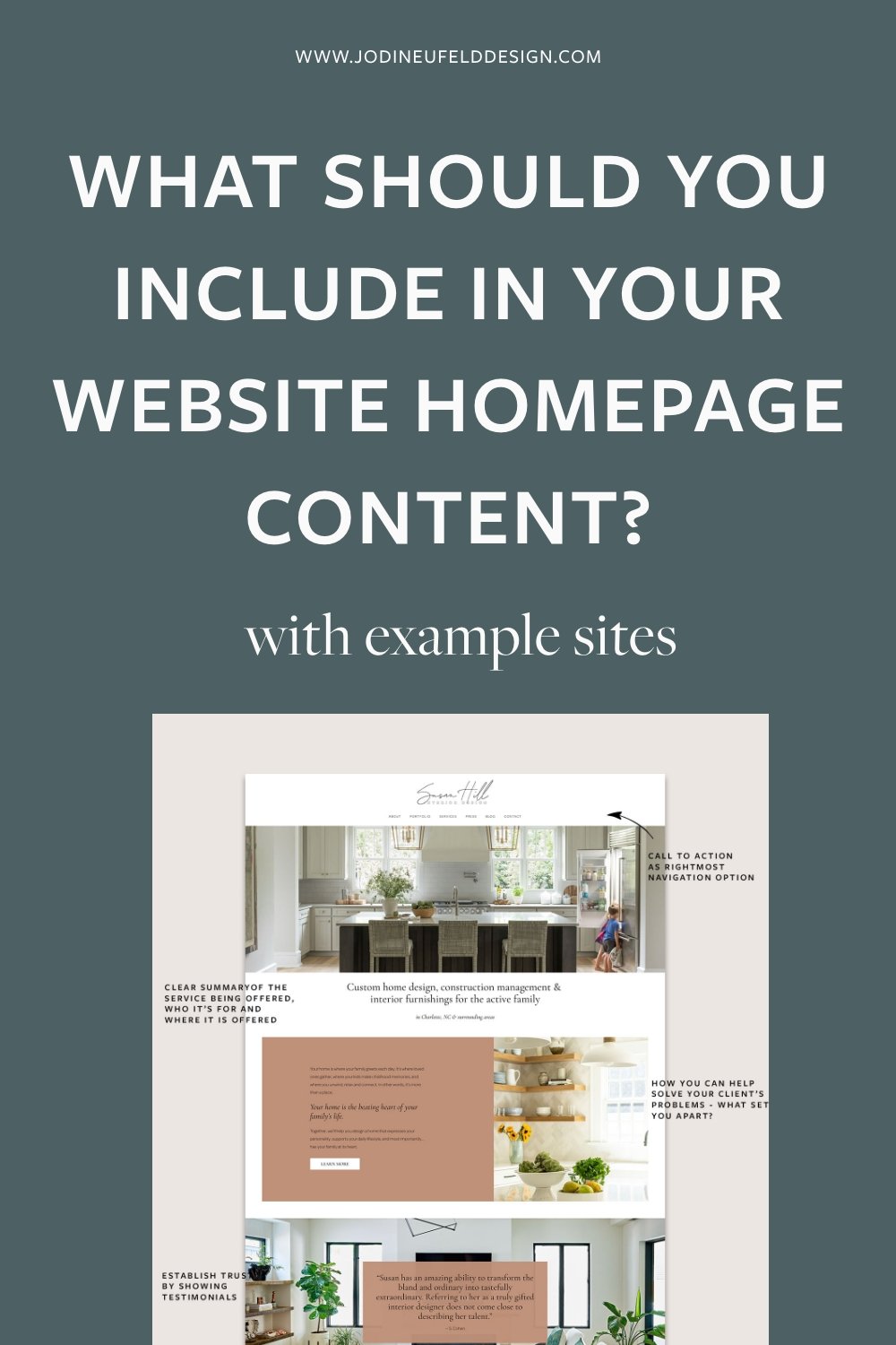
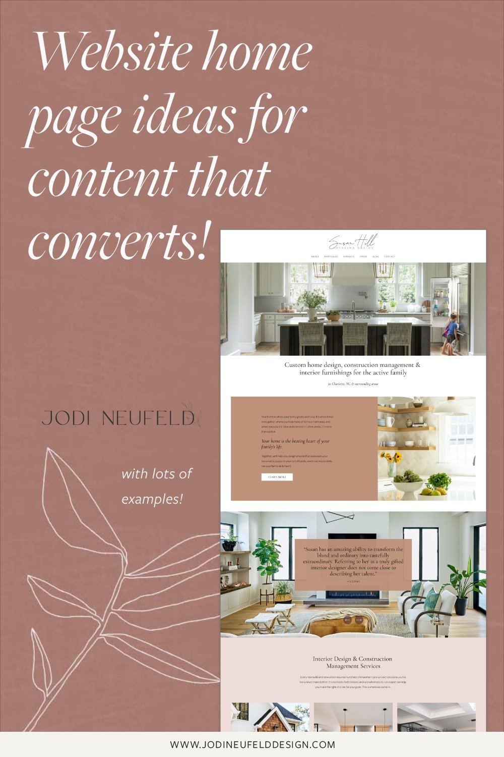
interior design home page banner statement
This interior designer concisely states what she does, who she helps and where she does it in her home page banner and also features some of her gorgeous work.

summarize what you do and how you help
✢
summarize what you do and how you help ✢
2. On your website home page, make sure to summarize what you do concisely
One of the biggest mistakes I see on home pages is not including words that describe how you can help. You probably have seen sites like that too. Maybe they just have one banner image and a footer. Or multiple photos in a gallery, but no text.
The one liner is a great start but then we need to show them a bit more about how we can help and give them more details to “pique” their interest.
Your words on the home page should concisely summarize your services and how you can help with your potential customers specific problem.
Having those words on your home page not only piques the interest of your visitors to click through to other pages and learn more, but we are also providing Google and other search engines with incredible information about our business and what we do. The home page is “weighted” heavily in our Google results so we want to make the most of it by including those keywords that we want to be found for in our headings and body copy.
home page example from a therapy site
In this home page for a mental health counselling company they do a great job of a one liner, a expanding on what they do and how they can help and a portal section to their different services that they provide:

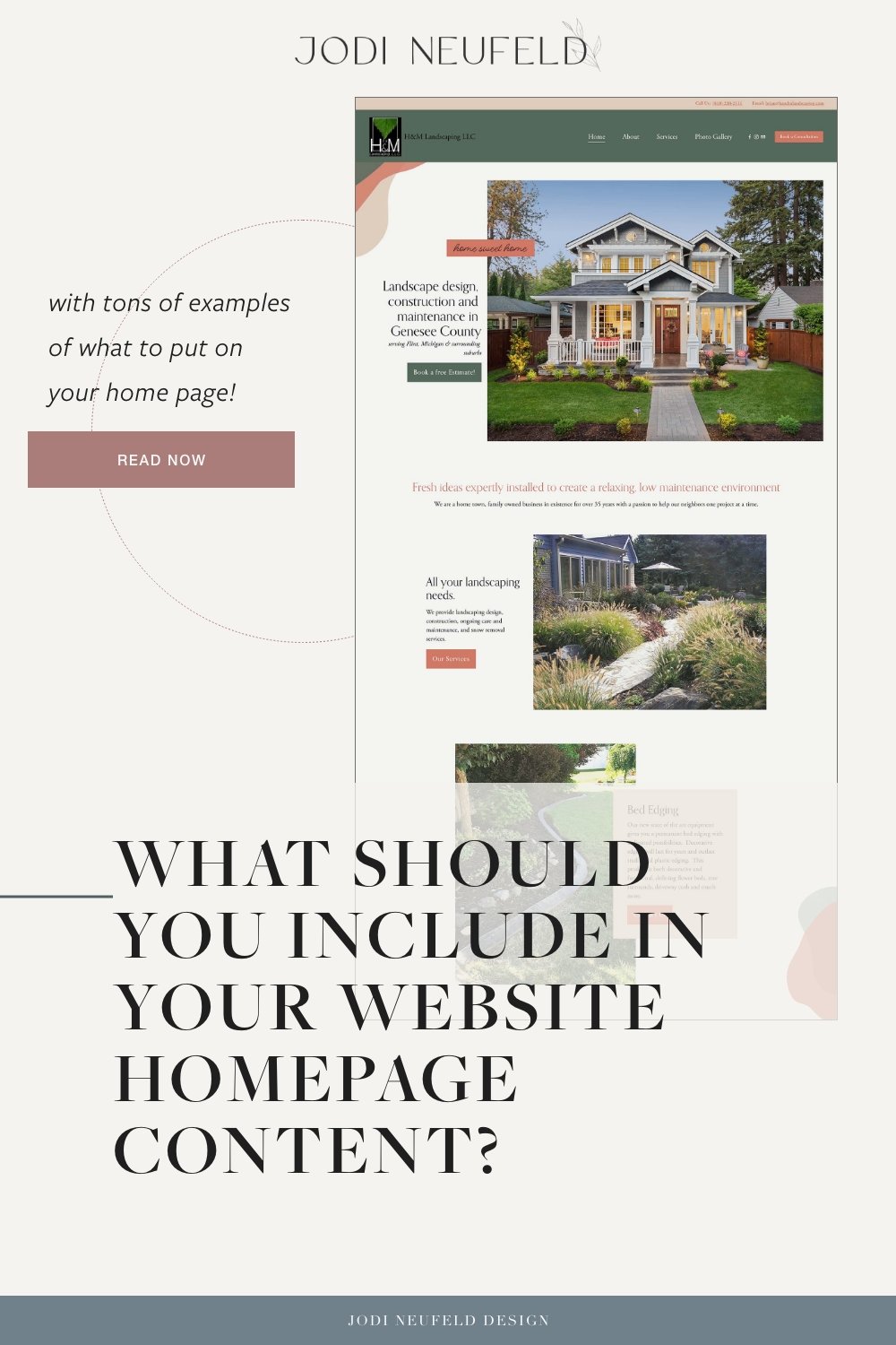
home page example for a landscaping company
This landscaping company provides all the details about what they do and where and then go into further explanations of what they do. You will see their service portal area slightly further down this blog post as well.

home page example for a wedding event venue
Here is an example of a Wedding Venue that addresses what they do and where and then expands on that in the section below.

provide a "portal" for more information
✢
provide a "portal" for more information ✢
3. Provide “doorways” or portals on your home page to other pages on your website that will go into further detail
Once you have introduced what you do and who you do it for and expanded a bit more about how you can help solve a problem, it is time to highlight your services and entice your visitors to click through to learn more.
Where do you want your site visitors to go next to be convinced that your work is excellent and that they want to work with you?
Likely you will want to send them to a portfolio (photographers, event planners, artists, designers etc) or to a page with your detailed services or packages (coaches, 1:1 service providers). For an online or brick and mortar store you will want to feature some or your products, either by category images or featured images and then direct them to your shop.
These “portal” areas on the home page will be the doorway into which our visitors will decide which “room” on our website they want to visit for more information. These areas are a perfect place to support our words with images of our work or eye catching graphics that will appeal to our visitors and capture their attention.
Let’s look at some examples:
photographer example of a service portal area
Here is an example for an underwater photographer (how fun is that!). Displaying her different services on the home page along with one photo for each service which allows her to show off her work and summarize what she offers.
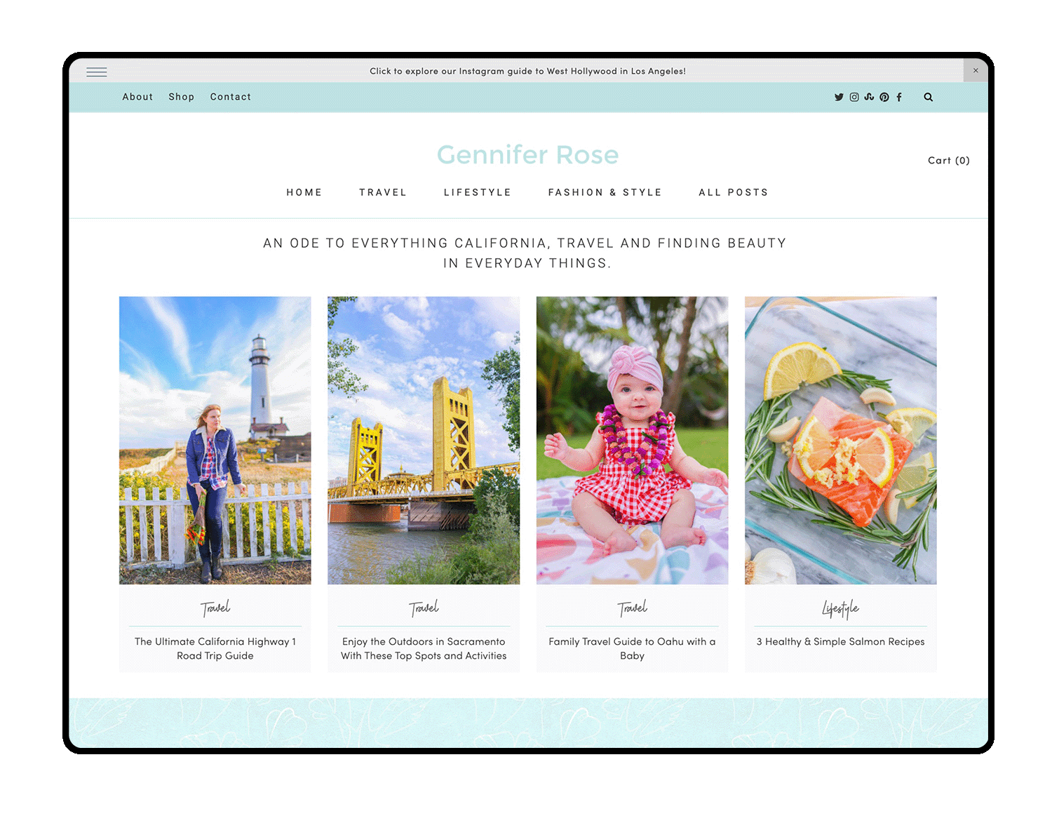
blogger /influencer portal area on home page
For this blogger/influencer, she does not have services to send people to, but she has a huge blog with different categories. Featuring those categories on the home page provides the “portal” for your visitors to proceed to those posts that they are interested in.
services portal area on home page for a landscaper
Using icons for your different services is an eye catching way of showing what you offer. For this landscaper, we used branded icons to show the different services with a button underneath that takes visitors to the services page for more details.

Tip: Looking for places to get icons? Check out my Resources page for sources for icons
establish trust
✢
establish trust ✢
4. Your home page is the first place you can establish trust with your potential clients or customers
It’s one thing to declare yourself the answer to your customer’s problem, but how do they know that you are an expert and that they can trust you?
We need to establish trust by showing that we are an expert on their problem and that we have helped others. So how do we do that?
There are many different ways we can show that we are trustworthy:
Show samples of your best work or most popular products
Providing samples of our work or products on our home page will give our visitors an idea of what we are capable of.
For this event planners site we featured a gallery reel slideshow as well as other large images and even a video to showcase her work.
This artist site features some of his best portfolio work on the Home page

For this freelance writer, having samples of her writing on the home page establishes that she has experience writing and will entice viewers to click to read more.

Display client or customer testimonials
Having a few testimonials on your home page is a fabulous way to establish your credentials! Choose 3 or so very strong testimonials that talk about how you solved your customer’s problem. Edit these down to make them short but have enough details about how you helped.
The first thing you will want to to is to make sure you have quality testimonials: ones that address how you solved your client’s problems. To learn more about gathering quality testimonials be sure to check out this post.
Tip: Pull out an important sentence from the testimonial and highlight it by itself to really draw attention to it.
testimonial section on home page for a coach/therapist

testimonial section on home page for a wedding event planner

Include some statistics that prove what you can do
The proof is in the results! What can you provide as concrete results from your clients or customers after working with you? What achievements have you accomplished?
Here are some examples:
Number of years helping people (number of years in business)
Awards you have won
Number of clients served
Number of hours you have saved your clients
Amount of money your clients have earned because of your work
etc
Here is an example of a freelance writer’s statistics to establish her expertise on her home page

Statistics don’t have to be boring! Liven them up with an animated counter.
Tip: Use the new scrolling block in Squarespace to add in some statistics in an interesting way!
Show logos of companies you have worked with or places you have been featured
Create a logo gallery to show off customers who have trusted you already. Show images/and or links of publications, blogs or podcasts where you have been featured.

Show featured blog posts on your home page
Including some of your popular content that addresses your visitors problems will entice them to read more and see that you are an expert on the subject.
Here is an example from my Home page.

a brief introduction
✢
a brief introduction ✢
5. Show your face and a brief introduction and link to your About page
We want to let our visitors know that we are a real people with a real business. This adds to the trust factor as well.
For a business that provides a service or even a small store with a personal touch, a welcome section on the home page is a great idea to briefly introduce yourself and talk about your brand manifesto.
State your beliefs as a brand to help your customers or clients know if your brand is the perfect fit for them. Include a high quality photo of yourself or team here. From here you will want them to head over to your About page to learn more about you and how you can help.
example of an intro section on the home page for an interior designer

encourage a long term relationship
✢
encourage a long term relationship ✢
6. Provide a way to start a long term relationship
If your visitors are interested in what they see, we want to begin a relationship with them that allows you to continue to help them and also offer them your services. But how will you entice your visitors to sign up for your email list? An email list is so important as these people are declaring that they are a fan and would be open to purchasing from you down the road. With social media algorithms so hard to crack these days, you never know if your followers will see your post. But with email it is much more likely.
Your website visitors are not just going to hand over their email address to just “receive updates” though. They need an incentive to allow you into their inbox. What would your ideal customer find helpful or worthwhile from you? Here are some ideas for freebie offering’s you could offer your website visitors in exchange for their emails:
A coupon code
Early access to purchase a product
Access to a VIP only event
Checklists, guides, tutorials, an email course series
Ideally, you want to treat your email list like gold and give them special advantages.
If you are offering a PDF download of any sort, it is a good idea to feature a picture of it to entice the visitor with it next to the sign up form.
In this influencer’s site her freebie offers are featured predominantly on the Home page to encourage her newsletter signups.

Still wondering what kind of download you could offer that would entice people to sign up and allow you into their inbox? Think of something that your ideal client’s or customer’s may be struggling with that you can guide them through.
Ideally this should be relating to one of the first steps to working with you, or purchasing one of your products.
So for instance, as a website designer, many people have downloaded my Website Content Planner for help in figuring what content they need on their website. When someone books a Squarespace Design Day with me, one of the first items I send them is a very in depth guide for coming up with the content for their website. I know this is a common issue and one that all website owners need to address so my freebie is an introduction into how to solve this problem.
Other ideas that perform really well are checklists. These are easy and quick to produce. One example might be a photographer who provides a checklist about “5 things to do to prepare for a brand photo shoot”. Brainstorm a way you could provide your ideal customers with a quick win.
This data science company encourages email signup with a free quiz to address potential client’s use of their data

have a strong call to action
✢
have a strong call to action ✢
7. Strong Call to Action section (many websites forget this very important step!)
How does your visitor go about working with you? Make it easy for your visitor to take the action you really want them to take!
What is the most important step you want your visitors to take? Is it to book a call? Fill out the contact form? Sign up for your email list? Buy a product?
Whatever that goal is, make that the primary focus of the home page. Including a button in the top right hand corner of your website that is set apart for this action is a brilliant way to highlight a call to action. You can also include a button in the header and/or footer.
This coach/therapist features a button to contact her (or ask her a question) in the main navigation that is highlighted as a button. Also, at the end of the home page she offers a free consult call as a strong call to action that she would like her visitors to take.


Using a pop up is another way to encourage your visitor to take action This works particularly well when your goal is to encourage your visitors to join your email list. You can promote your freebie download or bonus offer as an incentive to join your list in a tasteful way. What do I mean by “tasteful”? I would suggest not having the pop up appear immediately upon the site loading. Let the visitor look around to see what you offer and if they are a good fit before being “in their face”. Make sure your pop up is easy to close as well. I have visited some sites, especially on mobile where the pop up takes over the entire screen and the X is not visible to close the window. When this happens your visitors will likely just close the tab and not return to your site.
For this vacation home website the last section of the Home page encourages visitors to get information about availability and to explore reservations. This is the main goal for the website so it is important to end with this action.

examples of high converting home pages
✢
examples of high converting home pages ✢
Some Home page examples built with these conversion strategies in mind
Let’s actually look at some examples of home pages that do a good job of taking these principles and putting them into action. These are all websites designed by me :)
Example 1: Home page for a Mental Wellness Counselling site (website design done in one day using my Squarespace Design Day service)
This home page layout for this Therapy Business is a good example of a typical Home page for a Service Provider.
For any service provider site you will want to state what you do, who you do it for and where you do it (if you are location dependent).
Your home page should summarize what services you provide with links to learn more.
You will also want to include a brief intro to yourself and/or your team.
You can establish trust by showing testimonials or where you have been featured or articles you have written on the client’s problem.
In this case the main Call to Action is to book an appointment at the clinic. We made this button very prominent by having “floating” book an appointment button that appears at all times on the screen.

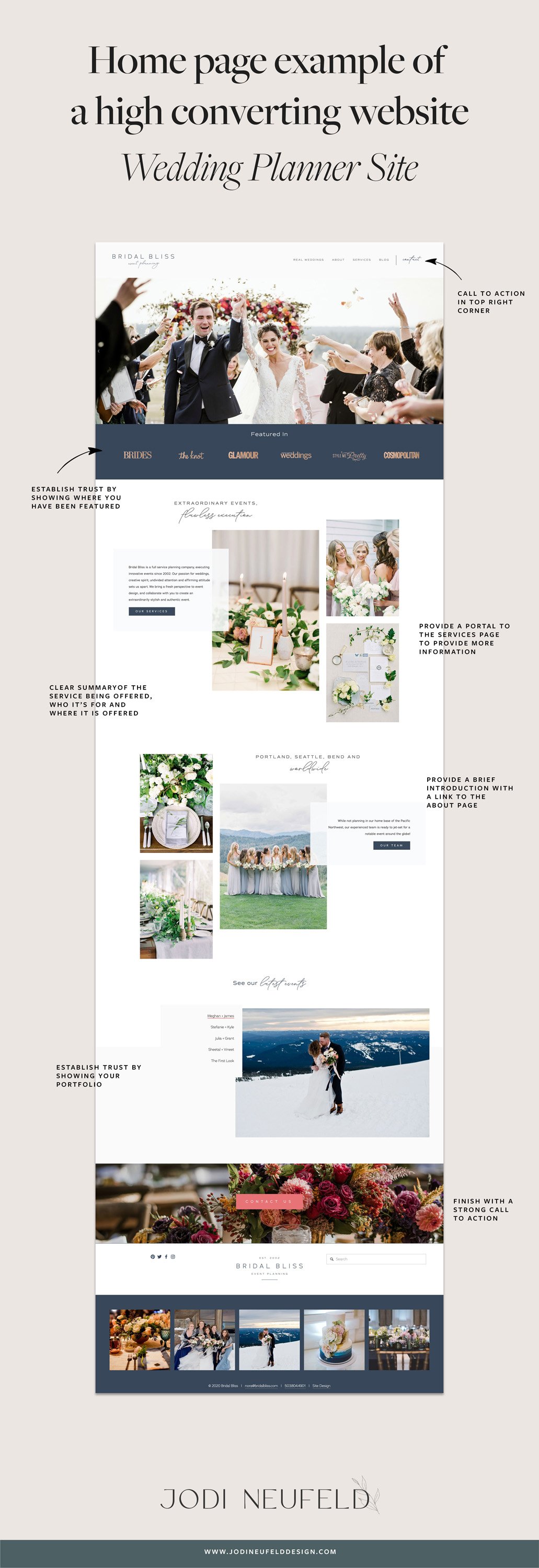
Example 2: Wedding Event Planner home page design
Event Planners will want to include the following pieces of content on their home page:
What they do and who they do it for and where they do it.
A synopsis of the different types of services they provide
A glimpse into their portfolio and their work. Ideally their photos should be all their own - avoiding the use of stock photos once they are established enough to have enough photos to display.
Events planners will want to establish trust by showing testimonials, showing where they have been featured or providing statistics of how many brides they have helped.
Since this service is very personal, you will want to include a brief introduction to yourself or your team on the Home page.
Typically the main Call to Action for an Event Planner would be to contact them or fill out an inquiry form.
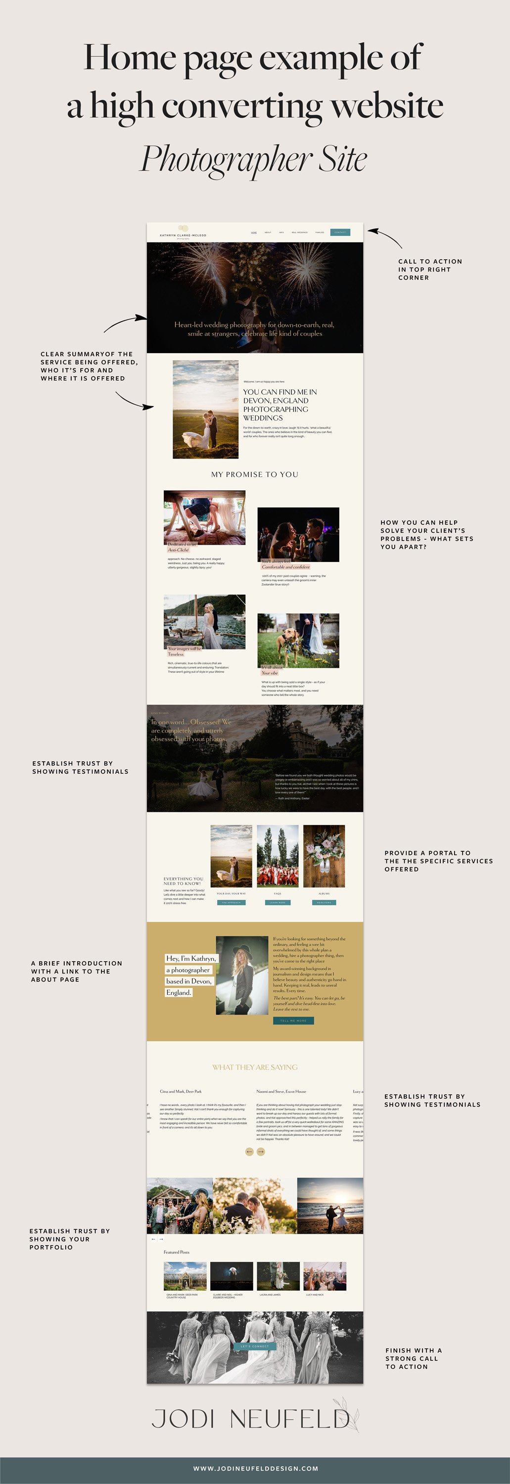
Example 3: Home page for a Wedding Photographer (website design done in one day using my Squarespace Design Day service)
A photographer’s home page will be quite focused on their images as it establishes their expertise and convinces their visitors to hire them.
Since this is very location dependent the location of the service should be very prominent on the website.
As with any home page, the synopsis of the type of service provided and whom it is provided for is essential near the top of the Home page.
Photographers will want to establish trust by showing testimonials, showing where they have been featured or providing statistics of how many people they have “captured”. Testimonials are a great way to include not only a rave review, but photos that you have taken of that person or couple.
Since this service is very personal, you will want to include a brief introduction to yourself on the Home page.
Typically the main Call to Action for a Photographer would be to contact them or fill out an inquiry form. A strong secondary call to action would be to encourage your visitors to explore your portfolio.
Example 4: Home page for an Interior Designer(complete website design done in two days using my Squarespace Design Day service)
Interior Designers will want to include the following pieces of content on their home page:
What they do and who they do it for and where they do it.
A synopsis of the different types of services they provide
A glimpse into their portfolio and their work. Ideally their photos should be all of their own work - avoiding the use of stock photos once they are established enough to have enough photos to display.
Interior Designers will want to establish trust by showing testimonials or showing where they have been featured.
Since this service is very personal, you will want to include a brief introduction to yourself or your team on the Home page.
Typically the main Call to Action for an Interior Designers would be to contact them or fill out an inquiry form. A secondary call to action would typically be to explore their portfolio.

Example 5: Home page for an Data Science business
This is a good example of a typical service based business in terms of what is required on the home page.
This site starts with a clear summary of the service being offered and who it’s for then goes into more detail about why the problem they solve is a problem for their customers and how they can help.
Right near the top of the page is a link over the their Services page to go into more details about their service.
There is a brief introduction to the team with a link to the About page.
Featuring blog posts on the Home page shows their authority on Data Science.
There is a strong call to action to contact them at the end of the home page.
They do an amazing job of enticing people to join their email list by offering a free quiz to assess their data use. The use of a graphic also draws attention to the area and makes it more appealing.

in summary
✣
in summary ✣
The Home page is one of the most important pages on our website to attract our visitors to do business with us. The content we provide on the Home page can increase the odds that they will either decide to hire us or else join our email list to be a potential customer at some point.
While this article covers the content you will want on your Home page, other factors for a killer Home page would be to layout your content in an easy to read way with headings and images so it is easy to skim. You will want to draw attention to the important statements by placing them in headings and using search engine keywords that you want to be found for on your Home page (this is a whole other topic!).
Also, I would really recommend working with a copywriter as they will help you not only come up with your messaging, but your Search Engine keywords as well.
All of these factors work towards a very high converting Home page.
Need help with your Squarespace home page layout or website? See how I can help with my Squarespace Design Day Service here!
pin it for later