
Creating powerful, flexible websites with the new Squarespace Fluid Engine editor
Effective July 2022, Squarespace will start rolling out their new Fluid Engine editor on all Squarespace 7.1 sites (if your site is on an older version of Squarespace 7.o and earlier this will not affect you).
Any new sections on a Squarespace 7.1 site will default to Fluid Engine now. Any existing sections prior to this roll out (July 2022) will not be converted unless you explicitly choose to do so.
What is Fluid Engine?
According to Squarespace: “Fluid Engine is Squarespace’s brand new editing experience. It operates as a drag-and-drop editor, meaning that users can simply drag elements to desired places on their website, giving designers like me more control to fulfill your creative vision.”
Essentially we are not limited to where we place new content now - just drag and drop it into position on a section of your website! Sounds amazing right????
Well… it is quite wonderful, but it will also add a new level of complexity, especially for DIY users as there are many more things to be aware of now. For instance, you will now need to style your mobile display separately (more info below) and there are other issues where it is very easy to have elements overlap when you did not intend for that to happen.
I am going to go over the new Fluid Engine editor in this post and will provide in depth tutorials on how to use it and what to watch out for when using it. Also, I will show you how to convert an existing section to the new editor and the pitfalls of doing that.
First of all let’s get some terminology out of the way and clear up some things.
The new Fluid Engine editor will be available only on block sections on any regular page, footers and portfolio sub-pages.
Fluid Engine willI not be available in:
blog posts
event descriptions
product additional information sections
auto list sections
gallery sections
The original editor experience up till now will be called the “Classic Editor”
any 7.0 sections
How to start using the new Fluid Engine Editor
You will be able to access the new editor as long as your site is on the new version of Squarespace(7.1). The editor will be present on regular pages, footer area and portfolio subpages but will not be available on blog posts, event descriptions or product descriptions.
To start using the editor, insert a new section on any page of your website. Choose a blank section or a pre made layout (the sections with an “I” on them are auto list sections and the fluid engine editor does not apply to these).
Once you add a section you will see a button titled “Add Block”. This works the same as the old “+” in Squarespace however there are a few important differences…
The block you add will just get “plopped down” at the beginning of the section and then you have to drag it to the correct spot.
Even though you are able to move your blocks around on desktop and mobile do note that screen readers will read the content in the order that you add your blocks originally so do give some thought to the order that makes most sense for someone who is visually impaired to read your site.
How to use the new Fluid Engine editor
Watch the intro tutorial video below on Fluid Engine or keep reading the blog post to learn how to use this new Squarespace feature
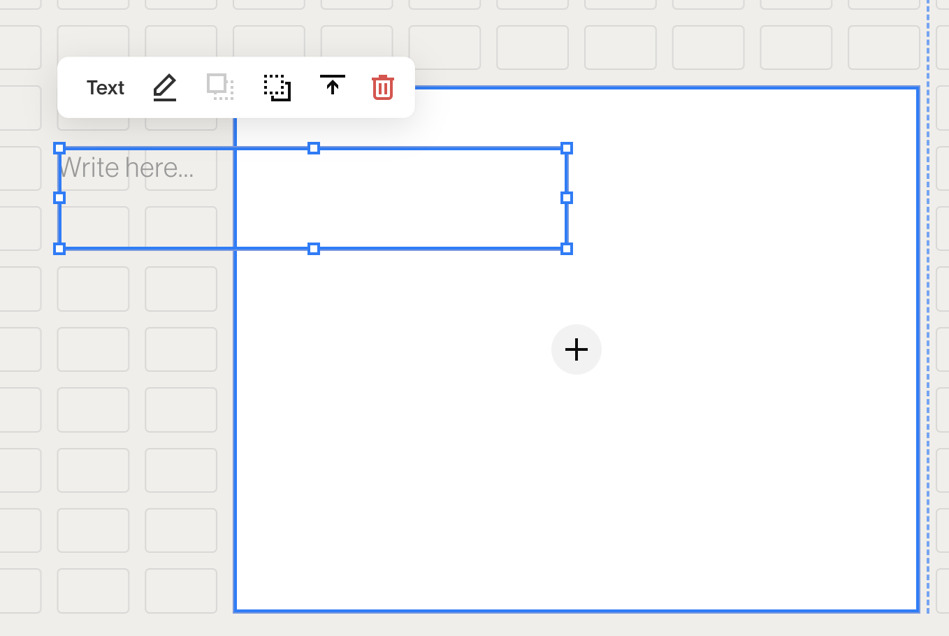
Ok let’s start exploring the available settings and how this new editor even works! This editor is built using a grid system. You can see a grid layout in the background at any time by pressing the letter “G” while you are editing your section.
You will see a vertical line that is the guideline for the middle of the section to help you align items.
When you click on the “Edit Section” button in the top right of the section you will now see different selectors than we saw on the Classic Editor sections.

In this screen shot I have turned the grid on by pressing “G” and added and image block which I sized by dragging on the bounding box around the image.
Press G to make the grid visible. Press G again to turn it off
On the “Format” tab we now have these options:
Row Count:
How many rows appear vertically in the section. Increase or decrease as you like here or you can also drag up or down on the blue button:

Gap:
If you want to control the amount of space between your blocks you can either select the leftmost icon (no gaps) or click on the 3 dots to set a custom gap amount.
Viewport:
This allows a bit more control over the height of a section. If you toggle it off the section will have no padding around it and content appears flush to the edges if you drag content to the edges.
If you toggle viewport on then you can choose between Small, Medium and Large height or even set a custom height by clicking on the 3 dots.
The alignment option is also available when the viewport is toggled on. If you have additional space around your content you can choose to align your content to the top, center or bottom of the section.
Moving and aligning your content
After you have added in one or more blocks you will have access to the tool bar for the item. The bar appears above each item with options to align the item (if applicable) or to move it forward or backward in the display order (this will only be shown if you have an item that overlaps another item).
In the example below if have dragged a text block on top of an image block. I now see the option to bring it forward (or above) the image (the square with the dotted outline below) or to move it below the image (the dotted square over the solid outlined square). I can also align the text within the block by clicking on the arrow to choose an alignment of top, center or bottom.
Fit or Fill options for buttons and images
Buttons and images allow more control over positioning and sizing by using the “Fit” or “Fill” option which can be found by editing the block and selecting the Design tab.
Fill: the image or button will fill the entire block space. Allows you to reduce space between elements and create elements that are “flushed” or aligned. Note that these blocks will have a different aspect ratio than the original version.
Fit: the image or button fits proportionally inside the block space. There will be extra spacing around the item and the aspect ratio will be unaffected.
The default for image blocks is fit and the default for buttons is fill.
You will only see alignment options when Fit is selected.
Playing with these values will help you to create content that is flush to edges of sections or to each other. Feel free to experiment but keep in mind that your aspect ratio will likely change unless you are careful to preserve it!
Moving multiple items
Yes! We can finally move multiple items at the same time. Simply drag around the items you want to move to highlight them. Click on one of the blocks and drag to the spot where you want them.
Adding background colors to blocks
Another much needed change! We can now add a background color to the following blocks:
Accordion blocks
Newsletter blocks
Quote blocks
Summary blocks
Text blocks
To add a background color, edit any of the blocks mentioned above by selecting the pencil tool and then the Design tab. Toggle the “background” to on. This color is set in the site styles panel for the color theme you are using. To adjust it open your Site Styles by clicking on the paint brush in the top right corner. Click on the color theme for your section and then find the “Background” color setting for the color theme to adjust it.
Watch the video tutorial on how to add color backgrounds to blocks:
Now we are easily able to create sections that have a background image (or color) with a text box on top that also has a background color!
Watch the video tutorial on how to add a background image with a text box with background color using Fluid Engine:
How to convert a section from Classic Editor to Fluid Engine (and a warning!!!)
To convert an existing section you should be aware that this action is permanent! ie you cannot undo it! So please be very sure you want to do this.
You will now see an “Update” button in any Classic Editor sections which will automatically convert your section to Fluid Engine. Be aware that the section will not look anything like your current section looks. You will have to set it up by moving blocks into place to emulate your original section. You will also need to do this for your mobile view! Don’t forget to do this!!
Also, do note that the following blocks are no longer available on Fluid Engine:
all image layout blocks : card block, collage block, stack image block and poster blocks. If you have these in your section and you convert the section you will have to rebuild these items by scratch.
spacer blocks: spacer blocks are no longer required on the Fluid Engine editor as we can drag items wherever we want them
How to recreate image layout blocks using Fluid Engine
As of the time of this blog post, image layout blocks such as collage blocks, card blocks, overlap blocks, stack blocks and poster blocks will no longer be available when using Fluid Engine. We can recreate most of these blocks manually (with the exception of poster blocks). I tackle the collage block and how you would recreate it in this video:
Your mobile view must be styled separately
Before most Squarespace sites looked “decent” on different devices but now there is the potential for a section to look downright awful if you forget to check your mobile view and move blocks around. You will definitely want to click on the little phone icon when you are in edit mode and view your entire page on the mobile view to make sure there are no issues.
The good thing about this is that we can create very custom mobile layouts without having to resort to code. We can have two images side by side if we want and even overlap text! Any changes you make to the mobile layout will not affect the desktop layout and vice versa in terms of the order and overlapping of the content.
As of this writing unfortunately Squarespace has not provided a tablet view. We designers are hoping that they add that soon!
How to keep using the Classic Editor in specific sections
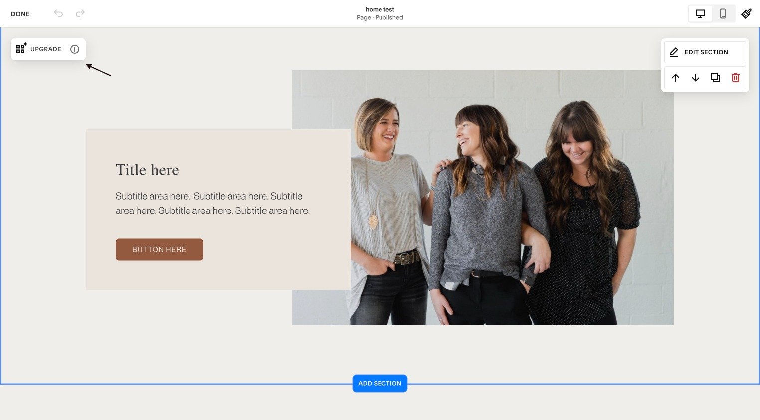
Unless you specifically click on the “Upgrade” button in an existing section, your current sections will remain untouched. Any new sections will be Fluid Engine by default.
Note: until December 2022 you will have the option to add a Classic Editor section if you so desire. You will find that section at the very bottom of the panel when you click “Add Section”

The pros and cons of the Fluid Engine editor
With added flexibility comes added potential issues. For users that are not comfortable with editing their own sites their is now more to consider (ie such as how your site will look on different devices, getting elements to align correctly, removing unwanted space etc).
I do believe this is the future of website design, but it needs to be tackled with caution. If you are someone who is quite willing to learn then I would suggest watching my tutorial above and giving it a try yourself. You can also access Squarespace’s Fluid Engine help guide here.