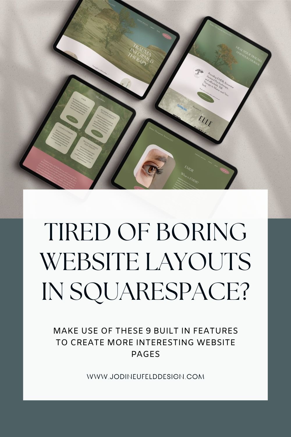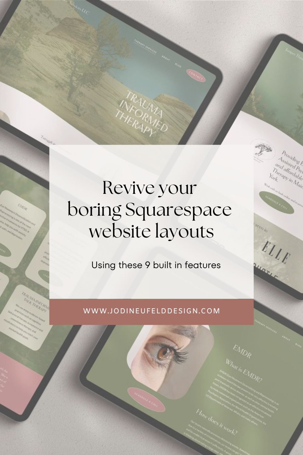
Boost Your Squarespace 7.1 Website with These 9 Powerful Features
As a Squarespace Design Expert, I see many clients who come to me frustrated by their “boring” Squarespace website which they DIYed. For these clients that are on the new version of Squarespace 7.1, they are amazed to find out that there are many built in features that they could access to create unique design for their websites which will help them stand out and not look so “cookie cutter” like.
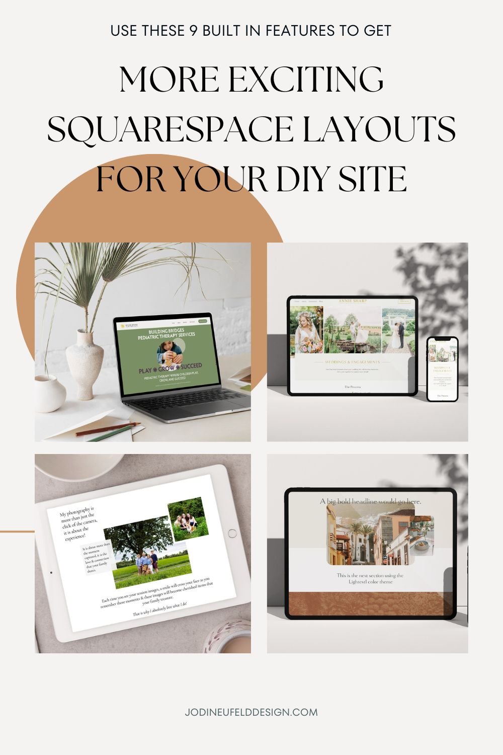
In this post I want to highlight 9 features you may access to create unique designs and layouts using built in features in Squarespace 7.1. I use many of these on my client Squarespace redesign projects and want to show you how you can use them on your site as well.
*** These techniques will only apply to the new version of Squarespace, which is version 7.1. Not sure which version you are on? You can verify by logging into your Squarespace website, selecting Website and then scrolling to the bottom. Your will see this at the bottom if you are on version 7.1.

If you are on Squarespace 7.1, you will have access to all of these amazing features to create unique website layouts and designs:
1/ Layered Elements
With the release of the Fluid Engine editor in Squarespace 7.1, we are now able to drag and drop blocks wherever we would like them in a section. This allows us to create designs with text overtop of images, multiple images overlapping and graphics over images or behind images and so much more!
By default, all new sections added in Squarespace 7.1 have the Fluid Engine editor. If you happen to have a site that is older or have copied over content from 7.0 then you will see and “Update Section” button in the top left of a section that indicates it is an older Classic Editor section. We are unable to layer elements in Classic Editor without using quite a bit of code.
In order to take advantage of layered elements you will either need to use the Fluid Engine editor(so essentially no need to change anything unless you see the Update Section button).
How to create a layered design in Squarespace:
Add 2 or more blocks (ie images, text etc)
Hover over each item till you see the hand tool and then move the elements to where you want them to be in the section.
Use the align tools for each element to position the elements within the frame vertically and horizontally
Use the “move forward” and “move backward” options to control the overlapping position of the elements
Here are some examples of layered sections:
Banner area for a Beauty Spa with layered images, text and graphics


Example of a layered website section from a service page on a photographer’s website.
2/ Highlight text feature
Such a fun way to draw attention to some text!
To use the highlight text feature simply select any text that you want to highlight and then in the text tool bar (which has the paragraph2, bold, italic etc) click on the “A” with the squiggly line underneath it:


Click on the text highlight option you would like to apply to the text from the menu shown. We have options for underlining, squiggly lines, circles, highlighting and more!
Then style the thickness of the line, color and even add animation using the design settings!

Here are some examples of the text highlight feature being used:

Two text highlight effects are used in the footer to draw attention to the freebie offering and to get subscribers to sign up for the email list.
The text highlight effect used on a banner image to add color and really highlight what the website is all about.

3/ Scale Text
The scale text feature allows us to control the size of any text block and control how many words appear on a line. When we use this feature our text will grow or shrink in size to fit within the size of our text block frame.
To use the scale text feature, select the text you would like to scale, then choose the option in the toolbar that is a capital A with square brackets on the top right and bottom left.

Keep in mind with this feature that your text will be forced onto one line so you will want to make sure it will be readable on mobile as well. This works best with very short sentences only.
Here are some examples of the scale text feature being used on sites I have designed:
Large scaled text in the banner of a Home page for a pediatric therapy site.

Scaled text used on a sales page banner used in conjunction with text highlights.

4/ Scrolling Block
This is the scrolling block
😀
This is the scrolling block 😀
The scrolling block allows us to have moving, dynamic text effects on our website. We can add text and/or emojis using our keyboard to this block. We can add any number of items and then alter the speed, direction and more.
To add a scrolling block add a block to your page (can be used in Fluid Engine or Classic Engine sections and in blog posts like this one!). Click on “Scrolling” or else search for the block by starting to type in Scrolling.
On the first tab for content, we can add in as many items as we would like in our block (1 or more). If you want to link your scrolling block anywhere you can do so here as well.

On the Design tab we can select a wave shape, set the size of the wave, the size of the text, add a color background, change the speed and more.

How to add a scrolling block in Squarespace 7.1
Here are some examples of the scrolling block feature:


Scrolling block and image shapes in use on a Sales page for a therapist

5/ Section Dividers
“Fancy up” the transition from one section to the next by toggling on the divider feature in a section. We can easily add a wave shape, a line and more in between one section and the next. We can also a stroke and change many settings.
To turn on the section divider, within a Fluid engine section click the “Edit Section” button in the top right of the section. On the Format tab toggle on “Divider”.
In the Shape area you can toggle through the different options by clicking on the arrows, or else click on the setting bars on the right of the shape to access the divider options.
You can add a stroke by selecting either the solid line or the dotted line. To turn off the stroke select the first circle with the diagonal line.
If the stroke has been turned on you can adjust the color and thickness using the options below the stroke.


When you choose the settings icon beside the shape block, you will have access to all the shape options as well as options for the width, height and alignment of the divider.
Play around and have fun! You can even click on “Shuffle Settings” for some random ideas.
How to create dividers in between your website sections in Squarespace:
Examples of section dividers being used:


6/ Shape Blocks
Shape blocks allow us to add in color and shapes and layer them in our webpage designs.
To add a shape block, click on “Add block” while in edit mode of the section where you want to add a shape. By default, a square shape block will be added in the top left of your section.

When we click on the edit option above the shape (the one that looks like a pen) you will have access to settings for the shape.
The first section has an arrow to toggle open the other shape options. Click on the desired shape you would like.
You can round the corners of your shape by entering a numerical value beside the sold and corner icons. So instead of “0” you could change to “50” for instance.
If you toggle on stretch, your shape block will fill the frame size that you have created. If you toggle it off, it will maintain the aspect ratio - for instance a square will remain a perfect square instead of a rectangle.
There are options to change the color,add a stroke, change the blend mode, add a drop shadow and blur it as well.
** Also, if you do not need a shape other than a rectangle, you can add a color background to a text box by choosing the paint can icon from the text tool bar.
How to add shape blocks in Squarespace 7.1 :
We can create the illusion of sections that spill over each other by using shape blocks. We can add a shape block in the color of the next section at the bottom of the previous section and place it underneath some elements to make it look like it overlaps the next section.
***** Important: always click on the mobile icon and set up your design in mobile as it will look terrible if you leave it as is. Mobile has to be styled separately than desktop.
See how to create overlapping sections with shape blocks:
Examples of shape blocks :

Shape blocks are great for creating pricing tables in Squarespace.
Shape blocks add color to our sections and interest as we layer them into our designs


Shape blocks were used on this page to create an overlapping design layout and to highlight the different service offerings.
7/ Full height sections
We are now able to make our images or shapes or any block for that matter go right to the edges of the section. By default, each section when added will have a padding setting of “medium”. In order to achieve full height sections we will need to click on the “Edit Section” menu (which appears in the top right of each Fluid Engine section when in Edit mode). Make sure “Fill Screen” is toggled off. This will make our content area go flush to the top and bottom of the section.
What can we do with Full height sections? Well, one things that is easier to do now is to have layouts with the image on one half of the section and the content on the other half. Our image can be stretched to match the height of the section. For best results make sure you have these settings for this layout to work:
Fill Screen off
Image set to Fill under the Design tab
Grid gap set to have no spaces (in the Edit Section menu)
Adjust the image focal point to make sure it looks good on all devices
Make sure you click on the mobile icon and set this up separately for mobile!
How to create a split layout in Squarespace 7.1 Fluid Engine:
Examples of full height sections:
Individual photos on a Wedding Photography site stretched out to fill to the top and side edges of the section.


split layout for a Home page banner for a Therapist website
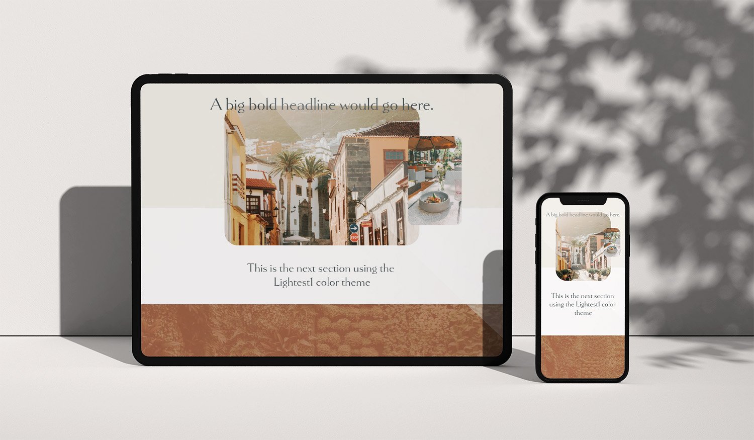
8/ Image Shapes
We don’t always want just boring square or rectangular images - sometimes a site calls for something more creative and now we have the option to select a shape for our images very easily!
To use the image shapes, add an image block, then click on Edit. Under the Design tab, choose “Shape”, then select the image aspect ratio you want your photo to be: 1:1 (good for circles and squares and maintaing aspect ratio), 2:3 (portrait aspect ratio), 3:2 (landscape aspect ratio).
Select the shape block you want your image to be cropped to.
Be sure to check your focal point is in the correct spot and check your photo on different devices.
How to use the image shape masks:
Examples of image shapes in use:

The circle shape was used for images in many places as well as the circle shape block to create layered designs
The arch shape was used to crop the image shape and then a shape block with another shape option was layered overtop.


image shape blocks and shape blocks layered with a graphic to create a section on a Sales page for a therapist.
9/ Change color of individual text elements
We are no longer confined to the color of the text that is set in the Site Styles panel for all text within a section. If you want the ability to highlight certain words by changing their color, it is easy to do now!!
To change the color of just certain words, select those words (or letters). In the text tool bar there is a colored circle that will show the default text color. Click on that circle and either choose one of the colors from your palette, or else choose a custom color by choosing Custom above the color swatches.

Examples of a website using the colored text feature :

The words “Romance Captured” are highlighted by changing just their color to an accent color.
The scale text feature is also used to create impact with larger text.
Squarespace is always adding wonderful new features like these on the 7.1 platform (which makes it a great reason to switch over to 7.1 if you haven’t already!).
I hope you find these features as wonderful and easy to use as I do and can start implementing them on your website to make it more exciting.
If you need assistance with your Squarespace website and would like to outsource it explore how you can work with me here.
Pin it for later