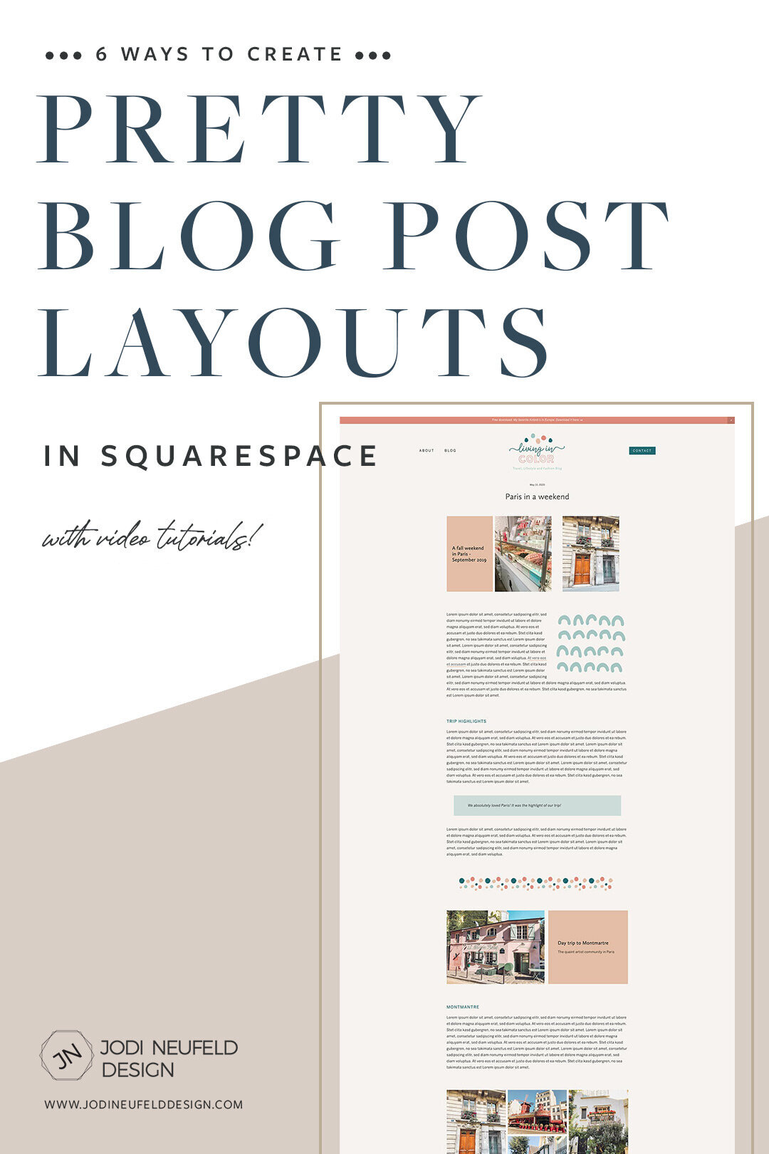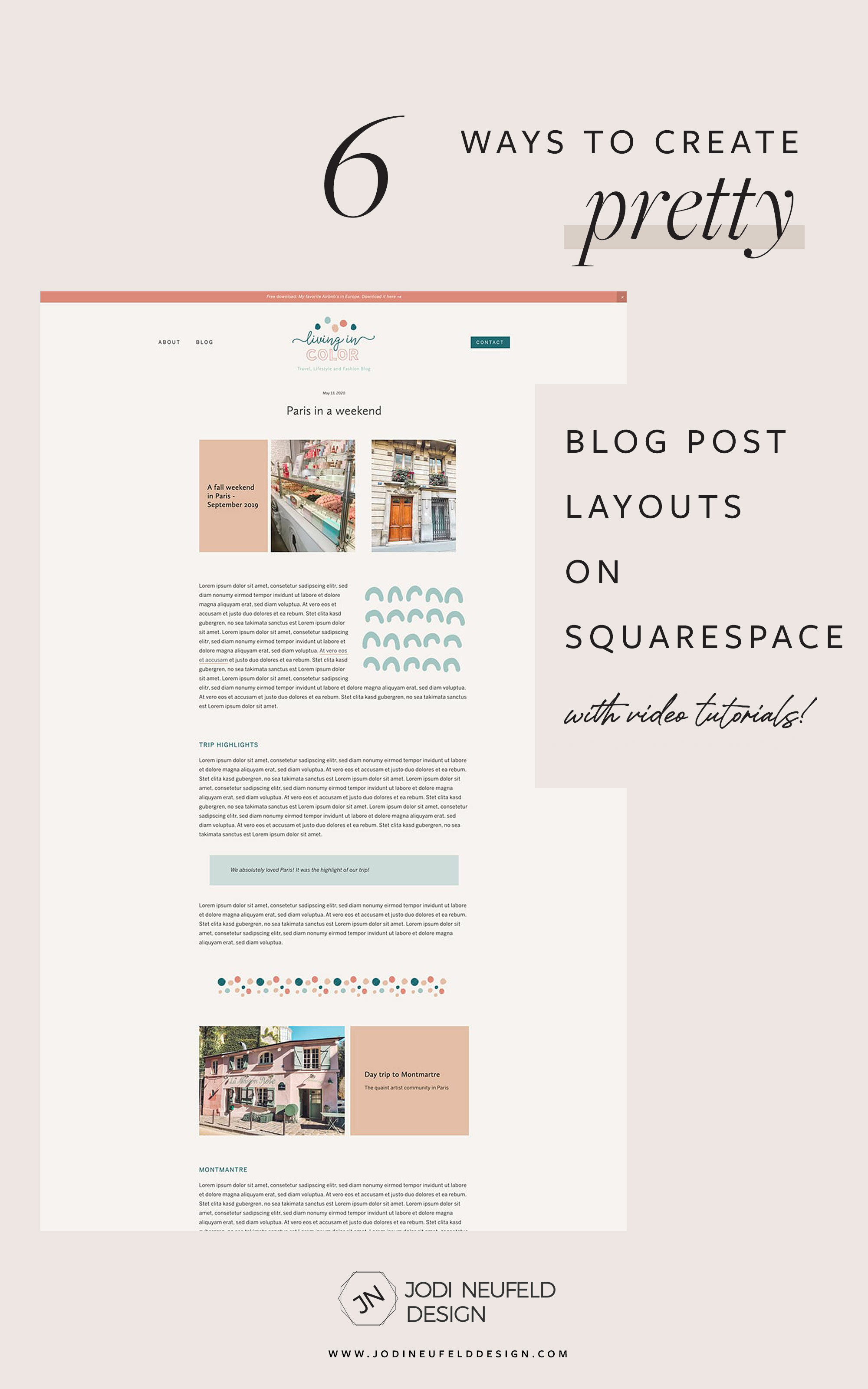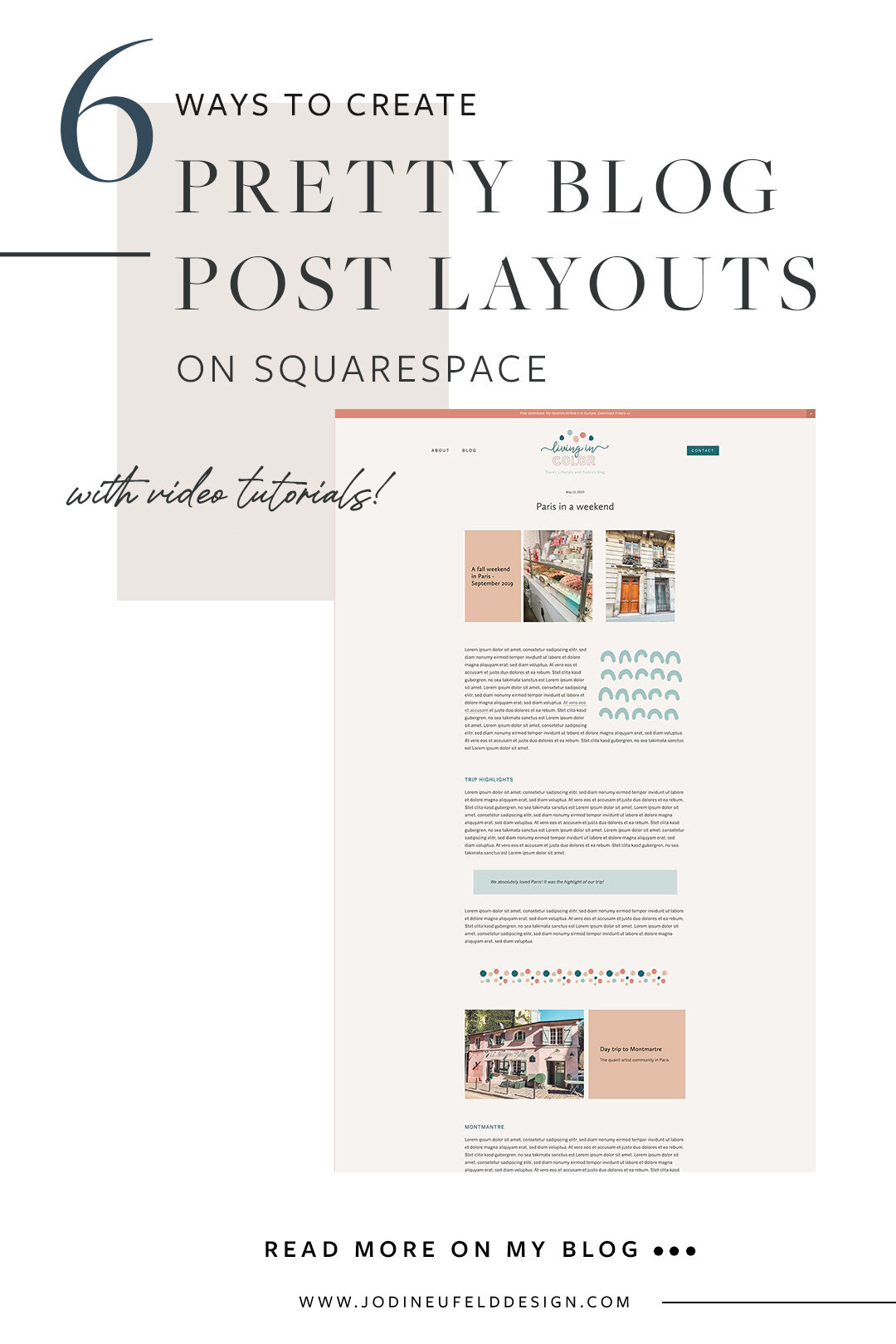
6 ways to create pretty blog post layouts on Squarespace
A common question I get is “how can I structure my blog posts so it’s not just all text upon text upon text?”. Because - reality check … not too many people are going to actually read all that text. Especially when there is nothing to visually break it up.
People scan content so you need to design with that in mind
I mean which version would you rather read? :)
BORING:

PRETTY!
Best layout practices
Some common techniques for easier to read web pages that you might be familiar with that apply to any pages are:
Using proper heading structure.
Such as:
Heading 1
Heading 2
Heading 3
Heading 3
Heading 2
Heading 2
Keep fonts consistent and don’t use too many
Using 2 - 3 fonts and varying the size, case, weight etc to vary them and make the headings stand out from the body text
Use images to break up the text
Keep your sentences and paragraphs short
Use bullet points and headings to break up the text and make it scannable
Keep your line length smaller than you think!
Make sure your blog post width allows for space on either side to create manageable line lengths for easier reading. We want to limit the line length to make it easier for people to read.
So those are the basic best practices for creating layouts that are easy to read and visually pleasing, but let's explore some other strategies we can use to create interesting blog post layouts using the tools we have on Squarespace.
1/ Use spacer blocks - your new best friend
- available on Squarespace 7.0 and 7.1 (Classic Engine editor only)
Spacer blocks can be your best friend in creating layouts. Inserting spacer bars in the midst of text will allow us to break up the space with some white space or breathing room, but even better, we can create columns to give us a ton more options.
We could display text in columns side by side, but I would encourage you instead to have a column of text with either an image or graphic in the next column to add some visual interest.
Adding in spacer blocks also helps greatly with the next strategy of creating interesting image layouts. Sometimes we only need them to set up a layout and then we can delete them once everything is in position.
2/ Be creative with image layouts (7.0 and 7.1)
- available on Squarespace 7.0 and 7.1 (Classic Engine editor only)
Breaking up your text with images is one of the best and most common ways to make your blog posts more visually appealing. This is especially true when you have a portfolio type website such as photographers and interior designers.
To insert an image in your blog, click on the insertion point where you want the image. Select “image” (on the top row) and then click the arrow to upload a photo
Please don’t overdo this though! Less is more. You will want to keep your blog posts limited to 30 images or less. Make sure you follow proper image optimization strategies as well so it does not slow down the load speed of your blog post.
Let’s explore some creative ways we can display images in a blog post:
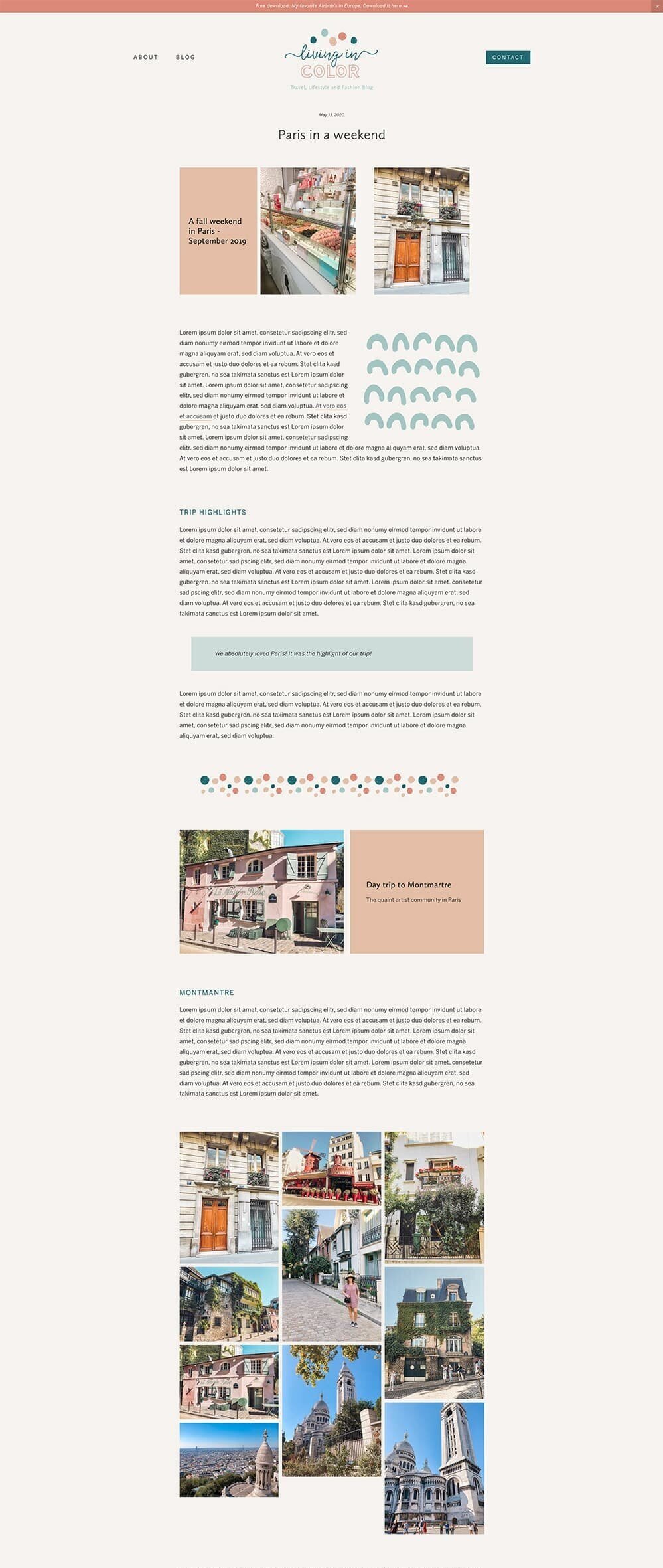
Example 1 - group images together
To create a grouping of images in a pretty way, you can use columns (using our friend the spacer block!). Placing them in columns means they take up less space in our blog post and we can create better impact with a group of photos.
We are creating this layout in these videos:
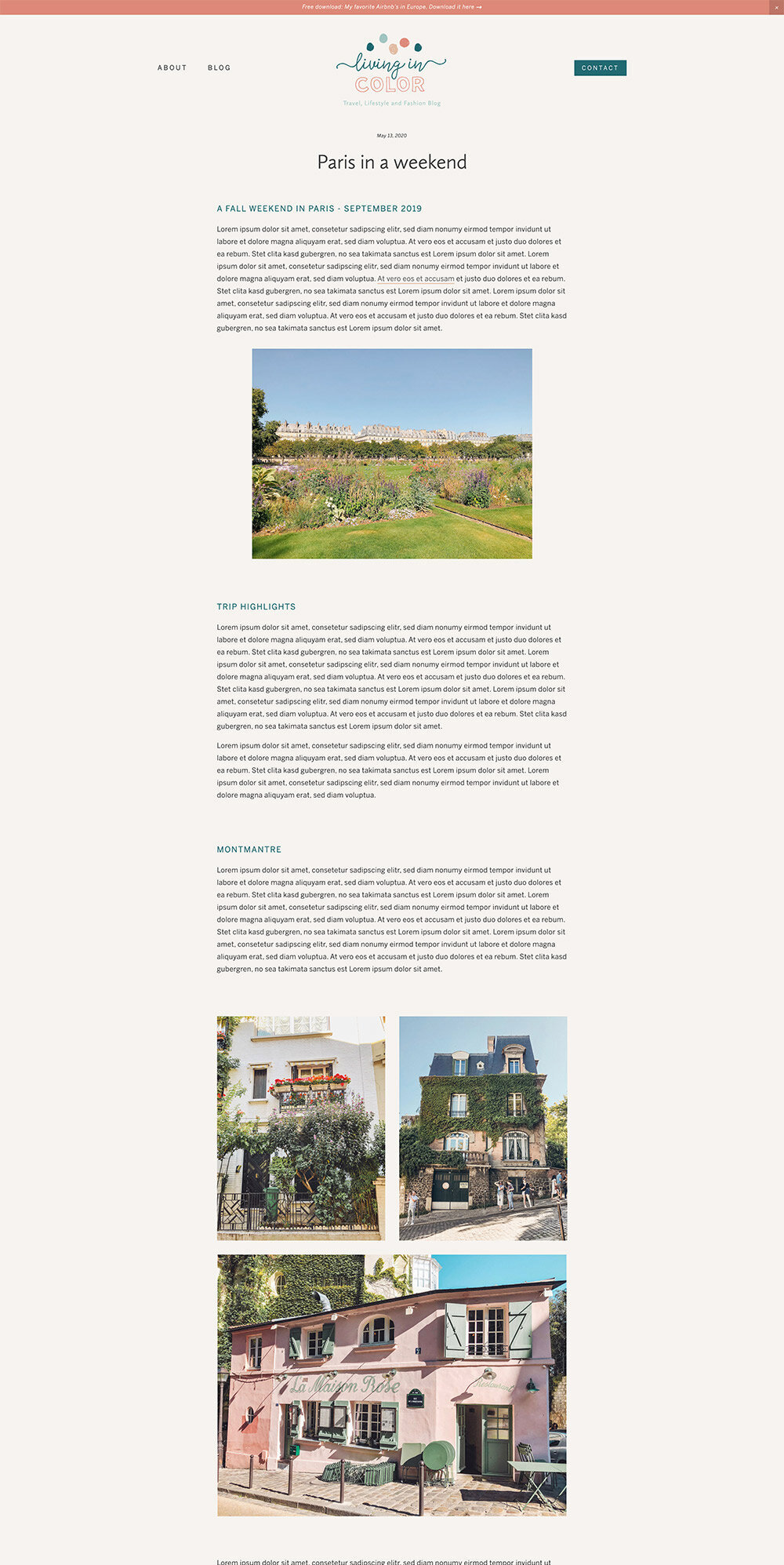
Example 2 - text flowing around image (classic engine editor only)
To create a unique effect, you can drag an image beside a block of text until you see a square outline and then let go of the image. This will wrap text around an image block. You can do this with any type of image layout block in Squarespace.

Example 3 - use gallery blocks
There are 4 types of gallery blocks you can use on any page in Squarespace including your blog. You can either upload your images within the block or else you can select an existing gallery(in Squarespace 7.0 only)
Click on the plus sign to add a new block in your blog post where you want your gallery to appear
Select “Gallery”
Upload your photos either by clicking on “+” to load one at a time or by dragging in images from finder, bridge etc on your computer. You can rearrange the images, add titles etc
On the “Design” tab choose one of the available gallery types: slideshow, carousel grid or stacked.
Here is an example of a grid gallery choosing 2 images across and a square aspect ratio.
If you want a masonry look that staggers images and shows them in their full image size you might consider puchasing the masonry plugin by Sqspthemes.
3/ Make use of the built in image layout blocks
- available on 7.0 and 7.1 (Classic Engine editor only)
Squarespace has some pretty nice image layouts that include text with images and even have button options. These layouts can be styled in the style editor to include your brand colors as well.
Placing these image layouts in your blog post will create a nice focal point and allow us to add some color into the midst of the text.
4/ Use the line block
- 7.0 and 7.1
We have easy access to a horizontal rule in Squarespace and we can change the color of it to match our brand colors. The line block is a great way to break up text visually or even highlight a block of text like a “call out” area of text.
5/ Make use of the quote block options
- 7.0 and 7.1
There are 2 different quote block options in Squarespace.
The first option is found as a content block when you go click on the insertion point. Near the top you will see “Quote block”. This is the standard block that is used to create a focal point of text. You can style the quote text font and size as well as the “source name” for the font in the Site Styles panel. You can create stand out text with this!
The other quote option is accessed from the text tool editor. With your cursor on a line or paragraph of text, select the “ from the text tool bar. The built in option for this adds a border on the left hand side of the text, but with some simple code you can easily add a bit of interest to this block.
BONUS TIP: To add some padding and a background color to the quote option from the text bar, add the following code to the DESIGN -> CUSTOM CSS area and adjust with your own colors. You can add a solid color using the hex value (ie #333333) or if you want to add some transparency, google the RGB value for the color and enter the 3 values in the the first 3 parameters of the rgba( ) section. The last value determine how transparent the color is as a percentage - so .5 would be 50%.
// blockquote from text editor - add padding and background color - remove left border
.sqs-block-html blockquote, .sqs-block-markdown blockquote {
padding: 2em 4em !important;
background-color:rgba(163,198,194,.5);
border-left:0px !important;
margin: 2em;
}If you want the same color to be applied to the quote block as well as the text editor then replace “.sqs-block-html blockquote, .sqs-block-markdown blockquote” with just “blockquote”
6/ Use graphics
Last but not least! This is my favorite way to add personality and visual interest to a blog post. We can insert graphics in the post instead of images in much the same way.
Just like the example we looked at above for the image with the text flowing around it, we can also do this with a graphic.
Instead of using the line block to divide text, we could add a custom graphic too by inserting an image block and uploading a graphic.
For 7.0
If you are on Squarespace 7.0 then you will have access to gallery pages which you can use to easily add in graphics to your site:
for 7.1
If you are not on Squarespace 7.0, you can still access all the graphics that have been previously uploaded to your site. You can insert a gallery block and then click on the “+” in the bottom right hand corner.
Search for your image or upload a new one
Select the carousel gallery option and then resize by dragging from the circle at the bottom.

For 7.0 and 7.1
Insert an image block as usual where you want your graphic to go. Either select it from your library of previously uploaded images or upload a new image. Once you have done this you have the option of adding an animation to your graphic by selecting the Design tab and choosing “Animation”
In this example I used the “focus in” setting:

With this option you will want to use spacer blocks beside your graphic or a column to text to make your image smaller. Read more about creating columns here.
Here is another example of a blog before and after using these techniques that I did on my Squarespace Design Day service for a therapist. In this case we only have text - no images, and no graphics and yet we can still make it look 100% better just using headings, bullets and spacing:
before:

after:

Both of these posts also have ideas for creative layout ideas:
My favorite Squarespace plugins and tools
Squarepace plugins I have been loving lately
So blog posts don’t have to be boring! You can combine the different options and create so many unique post layouts.
pin it for later!